

Bell Centennial
Bell Centennial is a sans-serif typeface commissioned by AT&T in 1976 on the occasion of the company's one hundredth anniversary. It's a fine example of a typeface designed for a specific purpose – to work with the constraints of the then new method of printing phonebooks.
40 Years a Face
To know the reason for Bell Centennial’s existence, we need to understand what came before it.
Centennial’s predecessor, Bell Gothic, was designed in 1937 by Chauncey H Griffith for the express purpose of maximum legibility with the prevalent technique of printing – hot metal composing on a Linotype machine, and printing on a letterpress. Paper quality was poor and Gothic had the responsibility of being readable at extremely small sizes. It had a good run of 40 years before needing to be redesigned.

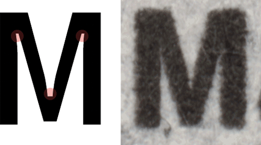
Bell Gothic is distinct for the cross bars on the uppercase I, the foot and cross bar on figure 1, and the angled terminus of the stroke on characters b, d, h, k, l, n, p, and q.
A Technical Shift
A shift in printing technology mandates the change to a typeface that can embrace new constraints better.
The shift in technology from hot pressing to Cathode Ray Typesetting (CRT) for composition and high speed offset lithography for printing caused a host of problems for Bell Gothic. CRT technology resulted in a tolerance of 0.0015" for the stroke thickness of characters, which often caused several characters to erode beyond recognition.

The effects of tolerance during modern photocomposition and reproduction would cause parts of Bell Gothic characters to disappear entirely. The original form is indicated in red.
Compensation was attempted in the form of over-inking, but these caused new issues. Legibility suffered as the already condensed letterforms closed in on themselves. The strokes of different characters ran into each other, making c and l become d; r and n became m; 3 looked like 8; 5 looked like 6. Moreover, presses had to be stopped frequently for cleaning, leading to losses in time and money.
A new typeface needed to be created: one designed specifically to embrace the constraints of CRT technology, for which Gothic was not designed.
Forging the New
Bell Centennial was designed to adapt to high speed offset printing on low quality paper.

Bell Centennial is a sans-serif typeface designed for printing on the low quality paper of AT&T᾿s phonebooks.
The new CRT technology allowed the same letters in different weights to occupy different widths – something which was not possible with old technology. This allowed Bell Centennial to have better hierarchy through different weights. Moreover, CRT required thicker strokes, which helped fight character erosion.
Matthew Carter was given the task of designing a typeface that had the modern look and feel of Helvetica, but had to be legible at sizes as small as 6pt. Carter took the decision of having extremely open forms to enhance legibility. Square cut terminals on letters with curved strokes further enhanced the open counters. Moreover, a large x-height made text highly readable at 6pt.

A comparison between the closed forms of Helvetica and the open forms of Bell Centennial. Helvetica’s closed forms caused readability issues at small sizes.
Letters were generously kerned to prevent ink from merging, and clear distinctions were made between characters that were similar – such as 5 and 6, or 3 and 8.
Arguably, Bell Centennial’s most recognizable feature is its incorporation of ink traps. These were designed to compensate for the spreading of ink on the low quality paper – a phenomenon called dot gain.
Ink traps compensated for the dot gain that occurs when ink spreads on low quality paper.
Bell Centennial successfully allowed the printing of more text with less ink and paper. It stands as a fine example of a typeface successfully designed for a specific purpose.
References
Nick Sherman > Articles > Bell Centennial
http://nicksherman.com/articles/bellCentennial.html
BELL CENTENNIAL
http://showinfo.rietveldacademie.nl/bell-centennial/#carter
Matthew Carter. Bell Centennial. 1976-1978 | MoMA
https://www.moma.org/collection/works/139307
Bell Centennial - Wikipedia, the free encyclopedia
https://en.wikipedia.org/wiki/Bell_Centennial
Bell Gothic - Wikipedia, the free encyclopedia
https://en.wikipedia.org/wiki/Bell_Gothic
A webpage by Ananth Pai
Information Design 2015 – NID Bangalore